FIGURES
PAGE
I, 2, 3, 4. The Destruction of Unity by Competing
Dualities.
7. 5, 6. Effect of Duality lessened where shapes are less
strongly marked.
7, 8. Duality lessened by differences of tone and texture.
8, 9, 10. Competition and destruction of Unity through
equalities in a plural composition.
11. Tendency towards Duality in the Treasurer's House, York.
12. The Doge’s Palace, Venice, Competition between ground and first
stories lessened by contrast of
treatment.
13. The Station, Tours.
A marked Duality.
14. King's Cross Station, London. A more successful attempt to overcome
Duality.
15. Minaret of the Grand Mosque, Kairouan. The apparent proportions
of door opening affected by surrounding crushing mass.
16. Basilica di S. Antonio, Padua. The verticality of the doorway
accentuated by accompanying verticals.
17. Tendency towards Duality in proportion of window
increased by conditions of its setting.
18. Duality.
19. Duality lessened by focussing interest towards centre.
20. Unity suggested by a ' link ' element.
21. Complete Unity.
22. The two original elements unified by the introduction
of a Dominant third element.
23, 24, 25. The use of the Dominant to provide Unity in
compositions of Plural elements.
26. A ‘balanced’ architectural composition (based on an
A.A. Student's drawing), in which the subsidiary elements to the right and left
are different in shape, but form a general balance of ' weight'.
27. An unsymmetrical composition (based on the work of a Student
of Columbia University), in which there is a free arrangement of elements which
combine to produce a centre of gravity which is practically in the middle of
the picture.
28. The Church and Convent of San Francesco, Assisi. A free and unsymmetrical
composition.
29. The Casa d'Oro, Venice.
A very delicate and clever adjustment of ‘ weights ' to produce a central focus
and a balance in a composition really consisting of two elements, but in which
the presence of a third is suggested, thus avoiding duality.
30. A composition of geometrical shapes and simple forms,
in which varying weights and tone values serve to form a balance between
elements of widely different shape. In spite of lack of complete symmetry the
centre of gravity remains in the middle of the picture.
31, 32. Sketches based on designs by Helmle and Corbett for
the ' Skyscraper of the Future,' showing how simple geometrical shapes (31)
form the basis of the finished architectural conception (32).
33. Church of the
Miracoli, Venice.
Contrast of elementary form, the cube, cylinder, hemisphere, octagon.
34. Contrast of line in the contour of form exemplified in
a candelabrum.
35. The Chiesa del Santo, Padua. Contrast in proportion between forms
of the same type and general contrast of geometrical shapes.
36. The Palazzo Communale, Siena. Magnificent contrast of horizontals
and verticals.
37. Geometrical pattern from the Cathedral of Monreale.
Repetition relieved by contrast of form and tone.
38. West Front of Wells Cathedral. A fine composition,
conveying an effect of decision.
39. A New
York Office Building. Indecision through continual stressing
of horizontals in a vertical mass.
40. Farnese Palace, Rome.
In spite of the fine feeling of this building, the solids and voids are
hesitating and weak in their relationship.
41. The Chapel, Trinity
College, Dublin. Solids clearly dominating over voids.
42. The Cloisters, Salisbury
Cathedral. Voids dominating over solids, typical of the Gothic spirit.
43. Lord Leicester's Hospital, Warwick. Contrast of
materials, tone and colour, harmonised by judicious handling.
44. Riccardi Palace, Florence.
Note the contrast in the surface treatment of the masonry in ground and upper
stories.
45. The San Carlo Theatre, Naples. The contrast of
character and scale between the two stories is so marked as almost to produce
an effect of separation.
46. Reconstruction of a room in a Swiss House, Zurich. The interest is
here dispersed by excessive use of contrast, resulting in a lack of main
contrast, e.g. between ceiling and walls. A solution might have been found in a
simpler wall treatment.
47. Church in Stockholm. Contrast in
shapes, both in the main mass and in the form of the tower. Dominant
verticality.
48. Loggia in the Piazza dei Signori, Verona. Pilasters as a useful element in
design, providing the accents and rhythm, and breaking up solids so as to obviate
competition with voids.
49. Prize design for Scottish Rite Competition, Portland, Oregon,
by Sutton and Whitney. Study in the treatment of rectangular forms without the
aid of classic detail.
50. The Einstein Tower, Potsdam,
by Erich Mendelsohn. Expressionism in plastic form.
51. Seamen's Union
Building, the Helder, Holland, by P. Kramer. A dignified and
well-massed handling of form with accompanying appropriate detail.
52. Fountain in Borghese
Gardens, Rome. Importance of line as contour of
objects.
53. Inn sign from Guarda (Engadine).
Importance of silhouette.
54. Residence in Berkeley,
California, by Louis Mullgardt.
Not free from tradition, but depending for effect on decision of idea and
plastic treatment of form masses to suit the site. Note unity of house and
landscape.
55. Design for a National Theatre, Amsterdam, by Th. H. Wijdeveldt.
Expressionism, study of pure form, breadth of treatment, consideration of site
in determining shapes.
$6, Design for Boating Club, Amsterdam, by de Klerk. Expression of
function, handling of form to harmonise with building's purpose and situation.
57. German design by Walter Gropius and Adolf Meyer for Chicago Tribune Building.
Study of massing of elementary form, relieved by accents definitely placed. The
building is in reinforced concrete and glass.
58. An Ionic entablature. Contrast in mouldings.
59. The entrance to an American hotel. Here we have '
positive '.
columns taking the arch weight, columns bearing consoles
which are practically ' negative,' and purely * negative ' decoration in the
arch spandrils.
60. The stern of Le Rot Soleil, a vessel of the time of
Louis XIV. Exemplifies the softening of ' positive' rigidity by ' negative'
accompaniments.
61. Leonardo da Vinci's painting of ' The Last Supper.'
Note contrast between rigid architectural background and free grouping of
figures, and the method of accentuating the central figure of Christ by
converging lines.
62. A design by a student of the Dutch Reijks
Academy for a People's
Hall. Severity almost unrelieved, showing tendency to ' dehumanise '
architecture.
63. The ' Grotto of the Pine,' Fontainebleau, Human figures semi-conventionalised
and used as a decorative motive. Structure here does not depend on their
presence as is the case with the Caryatid Porch of the Erectheion.
64. Window at the Wesleyan Hall, Westminster ; Lanchester and Richards,
architects. Sketch after the architects' drawing for sculpture over window to
main front. ' Negative ' masses tending to obscure ' positive ' function.
65. The Church of Santa Maria Aracoeli, Rome. Accentuation of the doorway.
66. The Dom Kirche, Mayence. Concentration by radiating pattern.
The arrows show the direction of the general concentration on to the sculpture
of the over-door lunette.
67. Central doorway of the Temple
of Angkor Vat as reconstituted at the
1922 Colonial Exhibition at Marseilles.
An effect of climax heightened by receding planes, and perspective accentuated
by repetition of motives diminishing in size.
68. Monument to the
Dead in the French Seminary in Rome,
by Roux-Spitz and Delamarre. The wings of the figures and the flow of the
drapery are subtly used to focus the interest towards the central name tablet.
69. Tomb of Lorenzo di Medici, in the Sacristy of San
Lorenzo, Florence.
The dotted lines show how the composition is arranged to guide the eye towards the
focus of the central figure.
70. The British
Museum Extension. Sir
John Burnet, A.R.A. Repetition of motive producing, not monotony, but a strong
emphasis of unity.
71. Winning design by Howells and Hood, for the Chicago Tribune Building.
Pronounced verticality eliminating necessity for wide and solid corner piers.
72. Premiated design, by Thomas Worthington & Sons, for
the East Lancashire Masonic Hall competition, Manchester. Dignity and repose through ample
wall surfaces crowning the scheme of fenestration.
73. The ' Five Sisters,' York Minster. Character of austerity and aspiration
conveyed by great height and simplicity of expression.
74. Station of the New Orleans Terminal Company, D. H. Burnham
& Co., architects. The ample effect of one large simple motive on a comparatively
restricted frontage.
75. War Memorial Chapel for Charterhouse School,
by Sir Gilbert Scott, R.A. A further example of verticality as an expression of
character.
76. The stack room of the New York Public Library, by
Carr^re and Hastings.
Definite proportions in fenestration as an expression of function.
77. Messrs. Real's shop in Tottenham Court Road, London. Effective handling
of shadow through varying depths of reveals.
78. Office buildings in New York. Heavy and ill-attached cornices,
relic of the Italian Renaissance influence, but in this case superfluous and
weak.
79. House at Greenlawn, Long Island, U.S.A.,
by John Russell Pope. The high roof as an aid to expression of character.
80. A San
Francisco shop-front, the fa9ade of which is almost entirely
in glass.
81. The presence of the triangle in Greek proportions.
Facade of the Temple of Poseidon at Paestum
(after Benott).
82,83. Longitudinal and transverse sections of the same.
84, 85. Geometrical proportions in Persian buildings. Gate
of Honour of the Royal City of Persepolis, and facade of the Tomb of Darius
(after Benoit).
86. The presence also in Byzantine proportions of the
equilateral triangle. Santa Sophia in Constantinople
(after Benoit).
87. Triangular setting-out in the Caryatid Porch of the
Erechtheion (after Benott).
88. The plan of Beauvais Cathedral and the relation of its
propor- tions to the ' vesica piscis'-
89 Geometrical proportions in the Palazzo Bartoloni in Florence. Note the
diminishing ratios of the stories.
90, 91. Geometrical relationships in details. Window and
arcade from Italian palaces.
92. Misplaced triangulation resulting in the effect of
creating a duality. The faceted palace in Moscow.
93. The formation of the ‘ vesica piscis ‘.
94. The equilateral triangle in modern work. Bertram
Goodhue's Nebraska
Capitol.
95. Illustrating the use of squared paper in determining
the general proportions of an elevation.
96. Geometrical basis of the Arc de Triomphe, Paris.
Stability by use of the square and circle.
97. Illustrating the use of squared paper in determining
the general proportions of a plan.
98. Brunelleschi's Church
of San Spirito in Florence. Analysis of geometrical proportions
and presence of the square as a basis for setting-out.
99. Chevening,
Kent, by Inigo
Jones (from Vitruv. Brit. 11).
Note how the row of square windows acts as a stop and climax
to the scheme of fenestration.
lOO. Hall window to the ' Deanery Garden,'
a house by Sir Edwin Lutyens. The window division is extremely pleasant, the
two lower divisions being five panes in height, the upper divisions each four
panes.
101. Rayland
Castle, Monmouthshire
(after Pugin). Various types of window. Note the placing of transoms which in
no case gives a square upper division.
102. At Hampton Court Palace the circular and square upper windows
duplicate each other's function from the point of view of composition, the
effect produced by this ' dual' stop to the fenestration being too emphatic to
be altogether successful.
103. Various types of transom division in windows ' a,' '
b,' and ' c ' .
104. An effect of overpowering scale is obtained in this
French student's design for a * Chateau Entrance ' by utilizing elements, large
in themselves, to build up an effect of scale through their subordination to
elements still greater in size. The wings give scale to the arched doorway, the
doorway to the columnar pylons, the pylons to the niche, and the niche to the
pediment. The size of the human figure gives a realization of the vast scale of
the whole.
105. Base of design for ' Monument to the Glory of the
American Nation,' by Despradelle. Another example of scale obtained by
juxtaposition of elements with elements still larger. Note the size of human
figures and columns at foot of steps. The columns themselves are large, but
appear minute by comparison with other elements.
106. A clock dial on a modern building. An instance of the
actual size or true scale being conveyed by the accident of the presence of the
human figure.
107. The nqw extension of the Selfridge Store ; Graham,
Anderson, Probst and White, and Sir John Burnet and Partners, architects. The
scale of this building is too large for most London streets under present conditions, and
is probably designed to harmonize with a future architecture on more ample
lines.
108. House in Grosvenor
Street by Blow and Billerey. Finely handled in
itself, the scale of the fagade is almost too overpowering for the architecture
of Grosvenor Street.
Note the difference of scale with the adjoining premises.
109. A doorway to a town house which the size of the human
figure and of the adjoining windows reveals as being too small in scale and
having too many elements for its actual physical dimensions.
110. A cinema fagade in which there is incompatibility
between the scale of the two stories. The scale of the upper storey appears
forced by the number and smallness of its elements, making this storey appear
larger than it actually.
111. The introduction of innumerable ambitious elements in
a restricted space results in falsity of scale and meanness of effect. This
French villa appears to be a large building until the size of the human figure
in the porch is observed. The elements are all too small to be treated in so
pretentious a manner.
112. An Ecole des Beaux-Arts project by M. Tournon for a
City Hotel. Note the balance of different groups and elements on each side of
the longitudinal axis, as also the interest and variety of plan shapes, and the
careful preparation of the central climax of the ' Winter Garden * .
113. Plan types—' A': The single unit. ' B ' and ' C':
Multiple units.
115. Plan of a house in Virginia (Goodwin, Bullard and
Woolsey). A symmetrical exterior arrived at by balance of different elements in
the two wings.
114. Ground plan of the Chateau of Versailles. Note the
preparation of climax through the diminishing recessed entrance courts and the
right wing with chapel and theatre, forming a balance to the left wing, in
which the unit elements are different.
116. Plan of lay-out of Cubley Village,
Penistone, by Sir Herbert Baker, showing small units repeating and used by
their grouping to form centres of interest. Accent of various points is
provided by communal buildings, churches, etc. .
117. Plan of the new London County Hall by Ralph Knott. The
central Council Chamber is the focus of the scheme. Note the approaches to the
climax and also the treatment of the fa9ades in which the requirements did not
suggest much plan modelling.
118. Plan of the new Town Hall, Stockholm, by Ragnar Ostberg. The site
demanded an asymmetrical scheme, and the plan generally is treated in a
mediaeval rather than a Roman spirit.
119. Sculpture galleries at the Vatican, including the octagonal
open court of the * Belvedere.' Interesting plan shapes justified by the
special purpose of the rooms and galleries laid out for the display of choice
works of sculpture.
120. A modern school plan, by Edward T. Allcock, with the Assembly
Hall as focal point. The classrooms and cloakrooms are treated as sub-divisions
of a block or unit, and not as individual isolated elements.
121. Plan of the front portion of the Palais de rinstitut, Paris. An example of
magnificence and dramatic effect gained by a recession of the domed central
pavilion, linked to the end pavilions by curved walls lower in height. The
central pavilion is in the nature of a prepared climax.
122. Diagram plan of the Port of London Authority Building by
Sir Edwin Cooper. The Rates Office is the focus of the scheme. Note the
preparatory vestibules, the plan shapes giving points of interest, and the
proportions of rooms to circulations.
123. Imperial Hotel, Tokyo,
by Frank Lloyd Wright. The plan lay-out reveals the simple rectangular modern
construction in reinforced concrete with main points of support and thinner
curtain walls. Note the difference in weights of walls, expressive of the
varying spans and character of the plan divisions.
124. The Temple
at Selinonte as restored by Hulot. Note the plan mosaic which is here not a
conventional indication, but represents the actual flooring. The design of the
mosaic is very well related to its position in the various parts of the plan,
the more brilliant patterns being reserved for the points which it is desired
to emphasize.
125. Theatre of the Champs Elys^es, Paris, by A. and G. Perret. A glance at the
plan reveals the light modern construction evidenced by thin walls and widely
spaced points of support. The plan shapes follow the type of construction, and
are but little imitative of solid masonry.
126. The so-called Cour Ovale at Fontainebleau. Note the old- type expression
of plan weights resulting from solid masonry construction with enormous reveals
and wall thicknesses required by the thrust of vaults, superposition of towers,
etc…
127. A second Grand Prix design for ' the Residence in
MorocCb of the French Representative,' by M. Leconte. Note the generally
symmetrical lay-out relieved by the diversity of mass ajid treatment in the two
wings which lessens the note of formality.
128. St. Peter's at Rome.
A plan reminiscent of the heavy construction of Roman work, with plan shapes
hollowed out of the solid. The ' weights ' of the supports reveal the location
of the dome and its abutments, greater than those required by the simpler
problem of the construction of the nave. Contrast with Plans 123 and 125.
129. House at Cumnor, Oxford,
by de Soissons and Wornum. An example of ingenuity in the balance of different
elements, and a semi-monumental type of lay-out applied to a small scale
residence.
130. Stoke Park, Northamptonshire (from Vitruv. Brit. III).
Said to have been brought from Italy,
this design ambitions a fully monumental type, with subsidiary and focal
climaxes and formal axial planning. The mass of the central block is weak compared
with the wings.
131. House at Ilkley, Yorks, by Sir Edwin Lutyens. Built in
the grand manner on a small scale, this plan shows both formality and
playfulness. It is a luxurious type, and not typical of modern economy, either
in planning or construction, but is interesting as a successful study in a
definite manner.
132. Little Garth, Syresham, by Biddulph Pinchard. The
typical English informal and ' romantic ' plan type. Axial lines avoided, and
picturesqueness and intimacy aimed at rather than stateliness.
133. A French villa of concrete construction by Le
Corbusier Saugnier. A very interesting and ultra-modern type, the domestic
dwelling handled like an hotel on a small scale. Marked axiality and suave
treatment of shapes.
134. Paris
flats, by M. Thion. Typical French planning, axiality, carefully studied and
balanced shapes, and an ingenuity of treatment in the avoidance of awkward
forms which English economy would only rarely permit in a similar case.
135. House at Hampste^d, by C. H. James (Hennell and
James). The present-day tendency in English small house design. Great economy
of space ingeniously managed by creating balance to obtain a formal exterior.
Tendency towards axiality.
136. Eastover,
Connecticut, U.S.A.,
by Charles Piatt. Typical of the American formal manner. Well-studied balance
and proportions, and general axiality - - - - - 125 137, 138. Elevation and
plan of winning design for the Tennessee Memorial by McKim, Mead and White.
Note the variations in the plans of the two wings, and the frank expression of
these in the elevation. The balance of the composition is preserved by the
maintenance of the running Order in each, while at the same time the
fenestration gives truthful expression to the internal requirements of the planning.
139. The New York State Education
Building, Albany, by Palmer and Hornbostel. Here the
facade takes the' form of a screen behind which occurs the fenestration
required for the various divisions of the plan. Expression of individual
apartments is subordinated to the dominating idea of a highly monumental
effect.
140. Design for an Art
Gallery by Easton and Robertson. Normal fenestration is
here not desired, and the elevation expresses the requirements of the art
gallery plan type.
141. The University Club, Chicago, by Holabird and Roche.
Note the expression in elevation of the large and lofty dining-hall on the
eighth floor. The collegiate Gothic treatment and the handling of the
fenestration marks the expression as other than that of the usual office
building.
142. The Banqueting House, Whitehall, by Inigo Jones. The reproach is
often made that the hall is screened behind an elevation which expresses a
two-storied interior. The presence of the gallery largely justifies, however,
the scheme of fenestration adopted.
143. A furniture storage warehouse in Chicago, by Ottenheimer, Stern and Reichert.
Expression of planning and function is here obvious and direct, and the absence
of normal fenestration has been frankly accepted, interest being legitimately obtained
by surface treatment.
144. The Pennsylvania
Railroad Station, New York,
by McKim, Mead and White. Note the expression in the elevation of the main
waiting hall, rising above the roofs of the subsidiary plan elements. The
desire for monumental effect makes this treatment practicable, and it is
logically expressed.
145, 146. Elevation and plan of Greenwich Savings Bank
Building in New York,
by York and Sawyer. In this case the exterior does not express the elliptical
banking hall, which dominates the plan. Such expression as might have been
obtained was probably not considered to be worth the sacrifices in other ways
involved, but the building would undoubtedly have gained in elevational
interest if the unusual internal shaping could have been used as the keynote to
the exterior design.
147, 148. Plan and elevation of the Church of the
Madeleine, Paris.
This is an instance often cited of false expression of plan in elevation. The
three main domed compartments of the interior and the apsidal end suggest a
facade of far greater interest than that revealed by the conventional Neo-Roman
temple treatment.
149, 150. Side elevation and ground plan of the Paris Opera
House, by Charles Garnier. This is one of the most beautifully studied plans of
any comparatively modern building, and its various elements are clearly
articulated and marked in the elevations, so that the main planning divisions
can readily be perceived without entering the building.
151. The main block of the Virchow Hospital, Berlin, by
Ludwig Hoffmann. An honest and interesting attempt to express a main staircase
in elevation. It is, however, open to question whether the resulting
elevational disturbance is justified by the importance of the element
expressed, which is not in this case dominating the building's conception, and
is not perhaps sufficiently interesting to call for such strong emphasis.
152. A typical American
Bank Building,
the First National Bank, Hoboken,
by Kenneth Murchison. This type is dignified and well handled, but contributes
little to the progress of architectural design.
153. The People's Savings Bank of Cedar Rapids, Iowa,
by Louis H. Sullivan. This building breaks away from tradition, and is a
straightforward solution of the particular conditions affecting the design. It is
by no means completely satisfactory, but is vital and interesting - - - - 141
154, 155. Two modern shops in stylistic character. Tudor House, Argyll Place, London,
by Edwin T. and E. Stanley Hall, and Whiteley's Stores, London, by Belcher and Joass. The former
building has adopted a sixteenth-century expression, considered the most
appropriate for the business of the clients. The latter is a large general
departmental store. Both buildings are built of modern fireproof construction,
and both have a surface treatment applied to the structure, and in this are
equally conventional. The convention merely differs according to the expression
of character desired.
156. A reinforced concrete grain elevator at Montreal. This structure
shows the immense possibilities of interesting handling of simple materials and
forms. The design is absolutely functional, but skill and knowledge are
evidenced in the handling of the resulting masses.
157. The Union Station at Washington, by D. H. Burnham & Co.architects.
A modern building treated in the antique manner.
158. The Great Northern Station at Minneapolis, by Charles Frost. This building
is an excellent essay in classic design, and has, like the Union Station, a
fine civic character. But it might serve almost equally well as a design for a
post office in the ' official' style of the larger American cities.
159. Helsingfors Railway Station, by Eliel Saarinen. A
praise worthy attempt at an expression, both functional and national. This big
building has the civic quality combined with vitality in design.
160. Building for the offices of the Berliner Tageblatt, by
Erich Mendelsohn. An essay in the most modern German manner, designed to
express the function and construction of an important office building, but
suffering from overemphasis and coarseness of.
161. Wireless Station, Kootwyk, Holland, by J. M. Luthman. An expressive and
interesting concrete structure, designed in sympathy with its material.
162. The Centre
Court Lawn Tennis Stand at Wimbledon, by Stanley Peach. An honest
and expressive concrete treatment, showing the architectural possibilities of the
most utilitarian structures.
163. The Botanical Building, San Diego Exposition (Bertram Goodhue,
advisory and consulting architect). This building shows straightforward expression
of function, satisfactory because of good massing and frankness of treatment.
--------------------------------


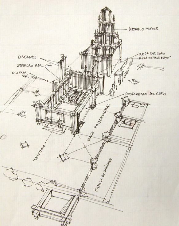
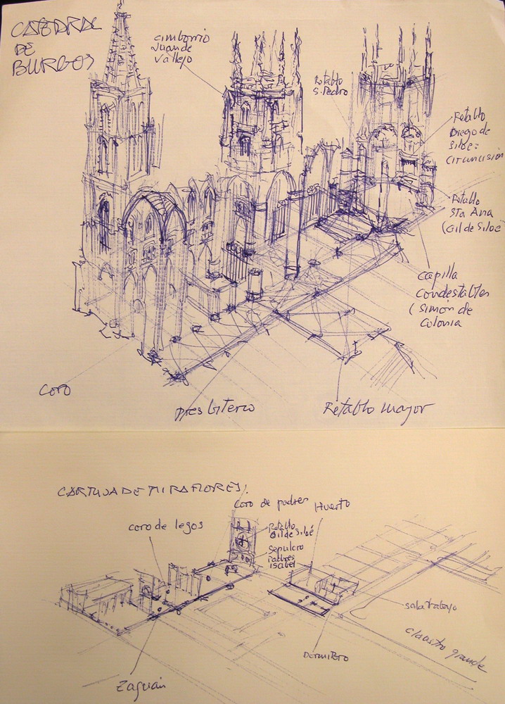
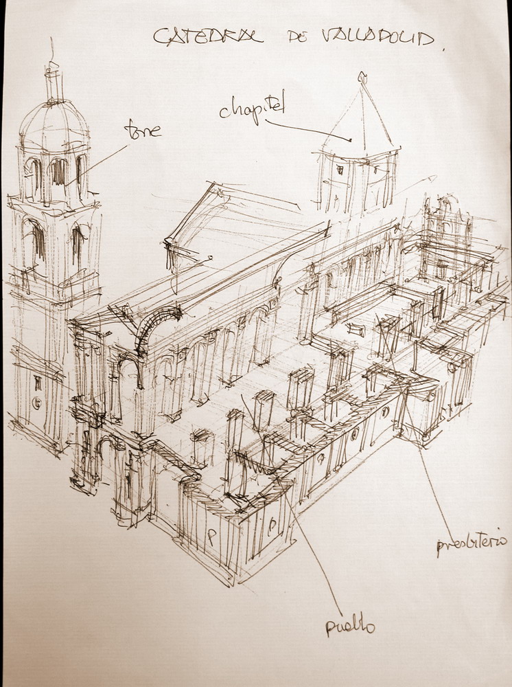
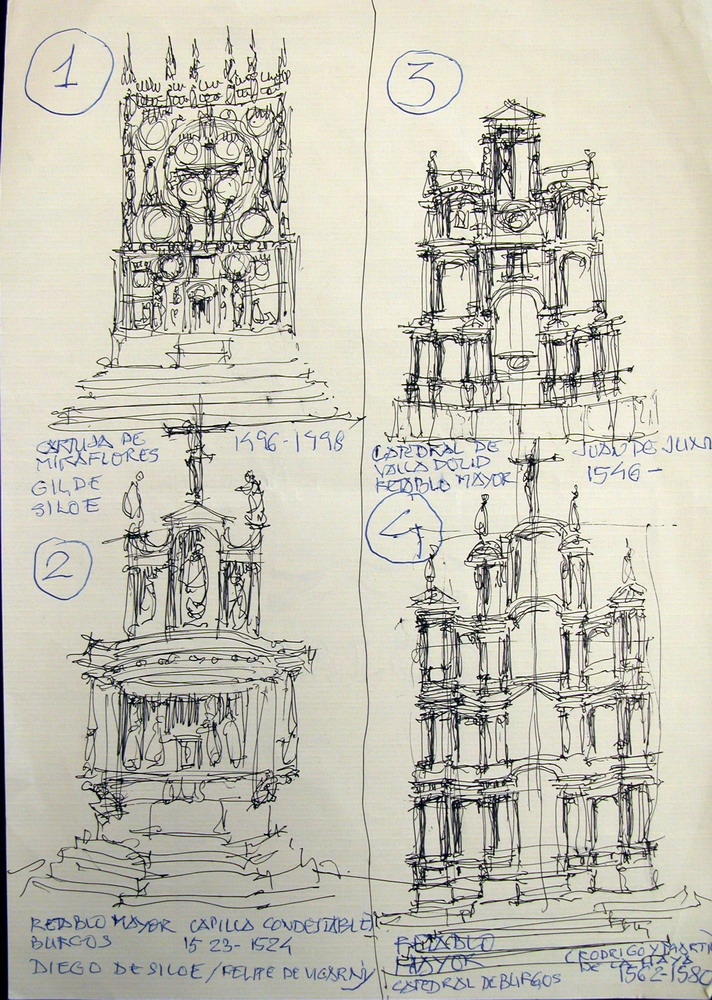
3. 3. How to draw buildingshttp://www.unav.es/ha/000-02-METO/dibujo-recetas.htmPERSPECTIVE AND PLOTSWe are prepared (and trained) to detect any sign of relief, however poor. But also notice inconsistencies quickly, for that matter quite well built drawings.We grow the building from its origin. Sometimes it is helpful to draw a "frames" prospects, networks of lines leak at two points which are not commonly found in the paper (fig 1). This means learning to draw fans congruent-lines seem to concur in a point out of reach. The time it takes plants recover, then it is easy to enter any line. With a little practice, we incorporate the perspective intuitively: learn to draw volumes consistent no helplines (fig 2). With a little practice, tracing the outline or base enough to give the feeling of volume (fig 2). Draw anything, big or small, cuts, sections, plans, elevations, and is very easy, the drawings present (fig 3 and 4) are drawn from memory on a bus traquetante engine running, on an outing with students, which I forgot to bring the documentation.
PHỐI CẢNH và các lô
Chúng tôi sẵn sàng (và được đào tạo) để phát hiện bất kỳ dấu hiệu của sự cứu trợ, tuy nhiên nghèo. Nhưng cũng thông báo không nhất quán một cách nhanh chóng, cho rằng vấn đề bản vẽ xây dựng khá tốt. Chúng ta phát triển xây dựng từ nguồn gốc của nó. Đôi khi nó là hữu ích để rút ra một "khung " triển vọng, mạng lưới đường mờ nhẹ tại hai điểm mà không phải là thường được tìm thấy trong bài báo (hình 1). Điều này có nghĩa là học tập để thu hút người hâm mộ đồng dạng đường dường như đồng tại điểm a ngoài tầm với. Thời gian thực vật phục hồi, sau đó nó rất dễ dàng vào bất kỳ dòng. Với một chút luyện tập, chúng tôi kết hợp các quan điểm bằng trực giác: học để thu hút khối lượng phù hợp không có đường dây (hình 2). Với một chút luyện tập, truy tìm các phác thảo hoặc cơ sở đủ để cung cấp cho các cảm giác của hình khối (hình 2). Vẽ bất cứ điều gì, lớn hay nhỏ, mặt bằng, mặt cắt, mặt đứng, cao độ, và rất dễ dàng, vẽ theo hiện tại (hình 3 và 4), vẽ theo ký ức trên một xe buýt đang chạy, trên một chuyến đi chơi với sinh viên, mà tôi quên mang tài liệu.
PROPORTIONS
There are no recipes for proportions. A drawing would provide a building slowly, starting from square. But in general, no time, we must plunge. It's like a jump, you have to try several times, but finally, the jump must be instantaneous, we can not settle for a drawing held and laborious, and also mediocre. The most common defects are exaggerated proportions: length, is decidedly longer, and the top is higher. There are people who unreasonably extend the columns, or increase the length of a palace. Many people, because they write in block letters or look too tilted sideways, bow their drawings. And very often draw larger or ignore the right side of a symmetrical figure. To correct these flaws, or at least warn, should look once the drawing upside down and the light. Our perception that perceives defects immediately detect a sense of direction.
Tỷ lệ.
Không có công thức cho tỷ lệ. Một bản vẽ sẽ cung cấp một xây dựng từ từ, bắt đầu từ hình vuông. Nhưng nói chung, không có thời gian, chúng ta phải lao vào. Giống như một bước nhảy, ta phải thử nhiều lần, nhưng cuối cùng, phải nhảy được tức thời, chúng ta không thể giải quyết cho một bản vẽ tổ chức và mất thời gian, và cũng tầm thường. Các khiếm khuyết phổ biến nhất là tỷ lệ phóng đại: chiều dài, còn quyết, và đỉnh cao. Có những người bất hợp lý mở rộng các cột, hoặc tăng chiều dài của một cung điện. Nhiều người, vì họ viết bằng chữ in hoa hoặc nhìn quá nghiêng nghiêng, cúi bản vẽ của họ. Và rất thường xuyên vẽ lớn hơn hoặc bỏ qua phía bên phải của một con số đối xứng. Để khắc phục những sai sót, hoặc ít nhất là cảnh báo, nên xem xét một lần vẽ lộn ngược và ánh sáng. Nhận thức của chúng tôi mà nhận thức khiếm khuyết ngay lập tức phát hiện một cảm giác định hướng.
QUICK DRAW WITH TRACER
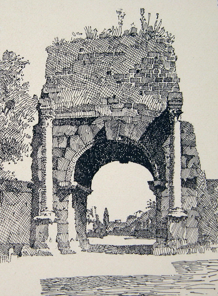
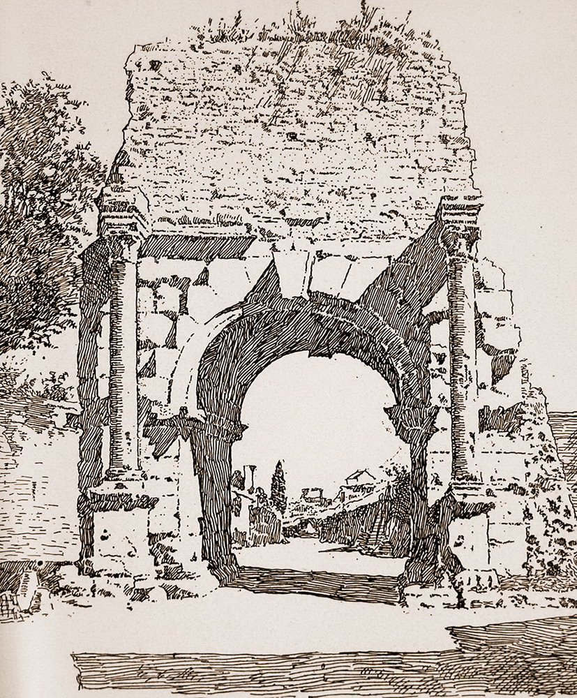
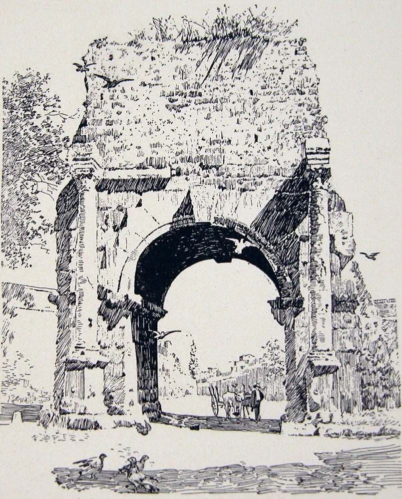
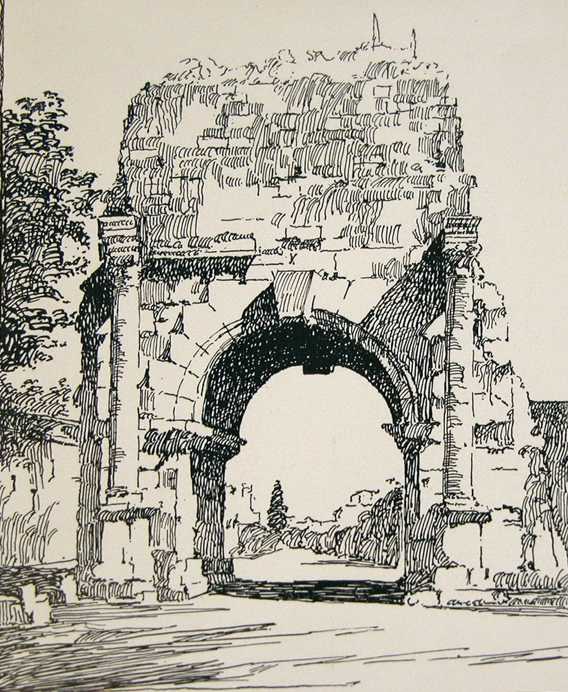
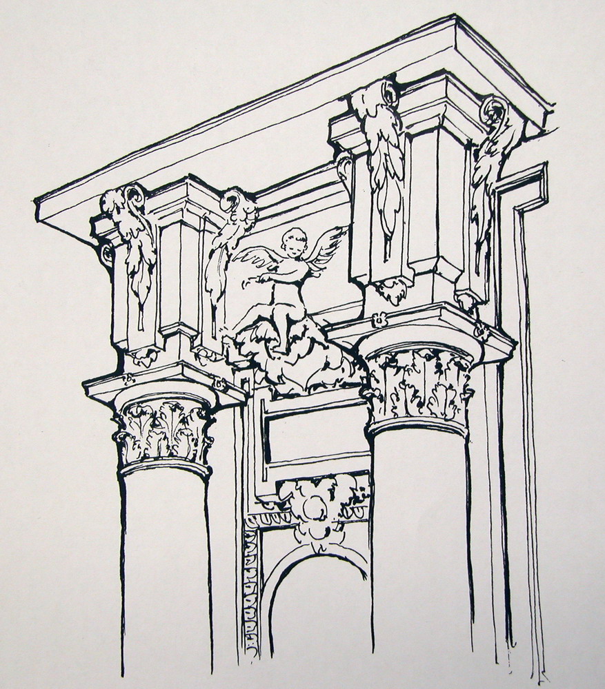
linesIt's good to draw with anything that stains, a pen or a marker that we have on hand. Years ago I was convinced that the best instrument would be a pen, now I think it is best to draw with the pen cheaply as possible, allowing fine lines to draw support and strengthen some other pressing. If we know what we want to draw, just the intention, is to draw lines that follow the direction that seems to suggest the elements. The drawings in Fig 4 memory I had to make the engine a bus that took us to Burgos on a school trip after discovering that he had forgotten the documentation: are drawn to photocopy and distribute them among the attendees, and are solved with simple lines and a streaked elementary minimal reminder; mediocre, but adequate. shades Fast shadows. The great contrasts. Effective in small pictures, or done very quickly. striped The artists of eighteenth century architecture took advantage of all of the scratches. In the detail of a Roman view painter Canaletto faster stripes are observed always in the same direction. The striped suggest both dark shadows and bright skies, colors and textures. The design retains the vibration of the transparency of shadows and reflections, which are never dull, and is a good lesson. Drawing with pen Since the early nineteenth century, widespread academic study and travel, spread architectural drawing itself to take note of the buildings they know in their travels. The new designers used a special instrument, which replaces the old reed pens or poultry: the pens of metal, steel, which spread from the first decades of the century. The nib, already common in the mid-nineteenth century was much more flexible, and the ink lasted a little longer, allowing a firmer line and length, but also a gradient of greater widths. But the steel nib, with his ink annexed, would be uncomfortable with the pencil. To nineteenth century, invented the fountain pen, the pen wrote many hours, allowing a faster stroke, a long line, and could be evaluated, as it increases its thickness when pressed on the pen, so that elements were introduced intense black, with an effective contrast. This type of pen drawing, reproduced very well in photographs (magazines), and was linked with historic architecture, for the pen is released while the eclectic fashions. And many architects sketched his sketches for this instrumental. Since the late nineteenth century to the twenties of our own, English and American schools of architecture train their students in this way that leverages the potential well of the pen. drawing with pen Since the early nineteenth century, widespread academic study and travel, spread architectural drawing itself to take note of the buildings they know in their travels. The new designers used a special instrument, which replaces the old reed pens or poultry: the pens of metal, steel, which spread from the first decades of the century. The nib, already common in the mid-nineteenth century was much more flexible, and the ink lasted a little longer, allowing a firmer line and length, but also a gradient of greater widths. But the steel nib, with his ink annexed, would be uncomfortable with the pencil. To nineteenth century, invented the fountain pen, the pen wrote many hours, allowing a faster stroke, a long line, and could be evaluated, as it increases its thickness when pressed on the pen, so that elements were introduced intense black, with an effective contrast. This type of pen drawing, reproduced very well in photographs (magazines), and was linked with historic architecture, for the pen is released while the eclectic fashions. And many architects sketched his sketches for this instrumental. Since the late nineteenth century to the twenties of our own, English and American schools of architecture train their students in such a way that exploits very well the possibilities of the pen. Textures Reproduce drawings of a competition launched in 1898 by Brochure Series (see: No 11, November, 1898), his jury was made by Bertram G. Goodhue (discussed) and Charles D. Maginnis, the two artists were exceptional pen (on Maginnis, see: Pen Drawing, 1898; on Goodhue, Architectural and Decorative Drawings see, 1914). It was a picture play pen Drusus arc, thus a section of the aqueduct called Antoniniana, which served the Baths of Caracalla in Rome. Competed more than 120 architects and students, and the leading listed here (Figure 5-10). They are quite elaborate drawings, little loose, but as representing exactly the same shape, learn how to express them materials of all kinds. black drop This kind of design is suitable to illustrate, it's about the shadow minimum stain, which allows improving volumes, and to suggest some textures that would be embarrassing petite more details. The cartoonists around 1800, as the illustrator John Flaxman (1755-1826), learned to draw with perfect lines and only slightly valued, the refined drawing figures that adorned the Greek ceramics, but it is necessary to train a lot, and have a special pulse - to achieve a line like: fine, safe and continuous. If we disregard this extraordinary perfection, it is very easy to draw anything, just drop lines and shadow (fig 11, 12). Learning with Howard Robertson In an intermediate genus are the following drawings, which illustrate buildings and elements on any scale. The long pulled out a beautiful book: Howard Robertson, The Principles of Architectural Composition, London: Architectural Press, 1924. Although this book is learned architectural composition, we took advantage of it to learn to illustrate: a rapidly represent historic architecture. There are nearly 170 drawings printed in the book (which reduces a little), and measure 7 or 8 cm. The author intended to illustrate his ideas about architectural composition, comparing various details and elements of many different buildings, you could not edit the book with many photographs, was forced to run fast cartoons, unpretentious quality. And the illustrations are illustrative, much more than if they were photographs.Trong một loại trung bình là các bản vẽ, minh họa các tòa nhà và các thành phần theo nhiều tỷ lệ. Một cuốn sách đẹp kéo dài: Howard Robertson, nguyên tắc của kiến trúc Thành phần, London: kiến trúc Press, 1924. Mặc dù cuốn sách này là biết được thành phần kiến trúc, chúng tôi đã lợi dụng nó để tìm hiểu để minh họa: nhanh đại diện cho kiến trúc lịch sử. Có gần 170 bản vẽ in trong cuốn sách (mà làm giảm một chút), và các biện pháp 7 hoặc 8 cm. Các tác giả dự định để minh họa cho ý tưởng của mình về thành phần kiến trúc, so sánh các chi tiết khác nhau và các yếu tố của các tòa nhà khác nhau, bạn không thể chỉnh sửa cuốn sách với nhiều hình ảnh, đã buộc phải chạy các phim hoạt hình nhanh chóng, chất lượng khiêm tốn. Và các hình minh họa là minh họa, nhiều hơn nếu họ là các bức ảnh. Obviously, the first is the general definition of the building. If we make a minimal schema, simply collect the minimum elements of silhouette, and articulation of walls. We begin by pointing out the domes, arcades (defined only by a small shadow) and a few holes, perhaps no need for everyone. The pattern suggests that there are more things that are not defined, that there are embellishments, the holes are deep, not a dull spot. 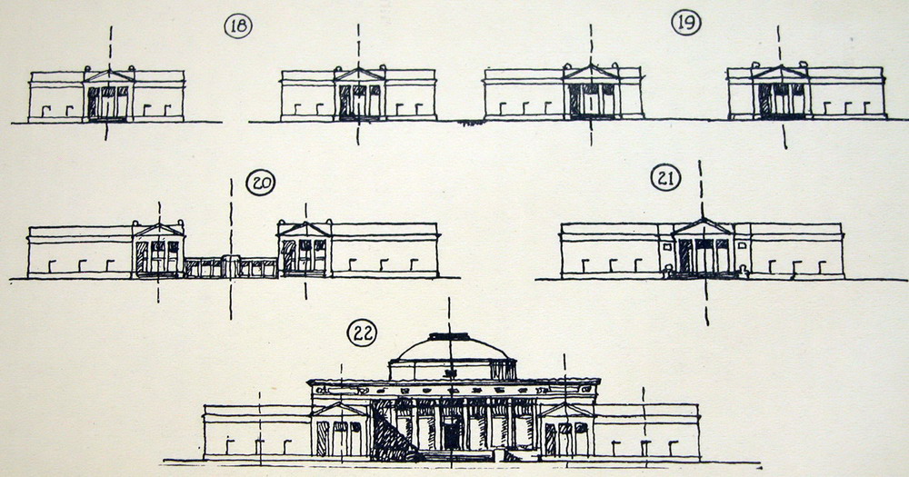  Know how to draw plants may seem complicated to a first-unattainable goal, but the plants in the historic buildings are often highly ordered, and abound in symmetry: no need to draw everything, sufficient to indicate the main spaces: While it is important to purchase a feeling tectonic the walls, not thinned or thickened so unlikely: so that the building looks like a paper cut, or a lump of clay is very easy (and rewarding) to draw lines, suggest areas and solid scratch. 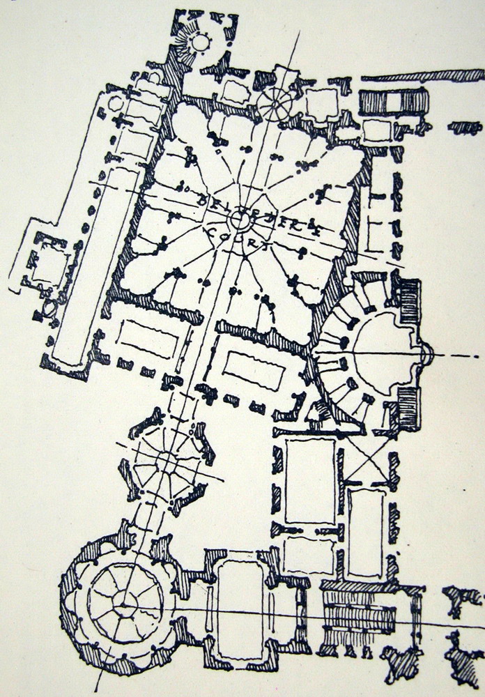 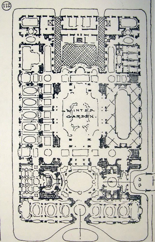 The textures are often very complicated very repetitive, and easily reduced to points and shadow areas, even in examples as puzzling as the elaborate facade of Wells Cathedral or the arches of a cloister: it is not difficult, but you should know how they are, to outline, in these drawings the arches are drawn, very fast, but cautions that are arcs, which are targeted, and which are visible, more or less, enough to give the impression of an ornate display of ornament trabajadísima or a complex molduración accompanying intricate arches. 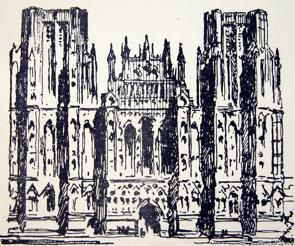 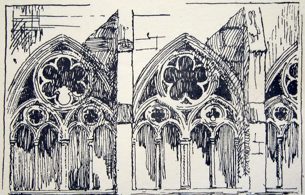 Ordinarily, the volumes are very simple, and whether to reflect only the elementary masses, just a quick scratch. The ordinary is presenting a finished and some texture: flashlights, ledges, gaps, and perhaps some ornament. 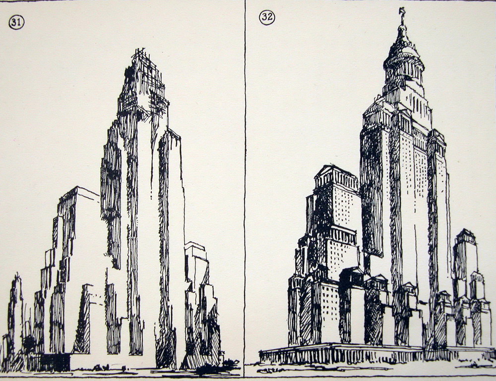 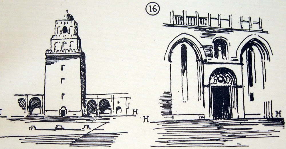  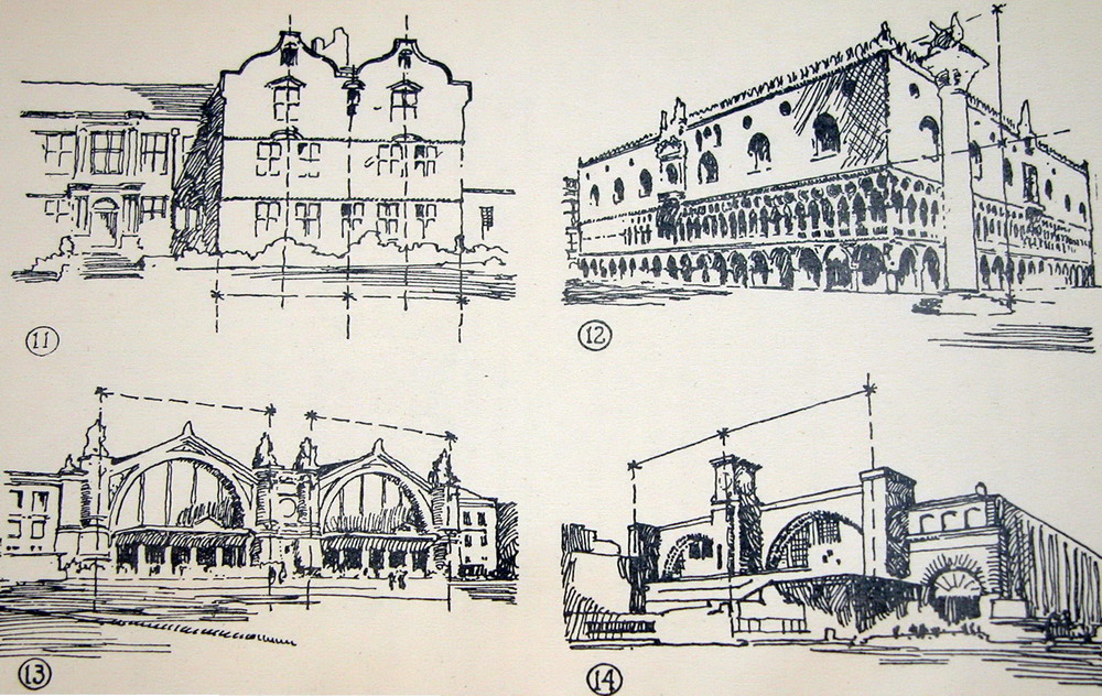 And the great buildings show a number of arches, niches, windows, ordinarily are pierced by large openings. It's easy to give the impression of an infinity of open windows neatly in a large area. According to the scale and degree of ornament is required to stop for a bit more, but never much. The more drawn is a unique element in the set will be noticed more, seek too much attention, and spoil the view of the whole. 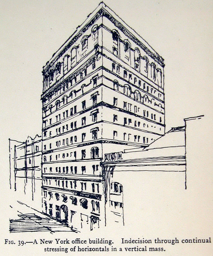   And The walls sometimes have very distinct textures: in general is very easy to tell, and is a nice discovery is not necessary to complete drawings and insistently, can be replaced by some brief shadows, and even do so only in some areas, leaving the others for understatement: a hint is enough.   The classical building facades are particularly easy to summarize. The two examples below are significant. No need to draw all the gaps, and fewer still give them exactly the same treatment. But you can not do without informing Minimum horizontal moldings and friezes articulate the facade and trim the fences that mark the main spans (dust and pediments), and a special feature as heraldic crests covers with.  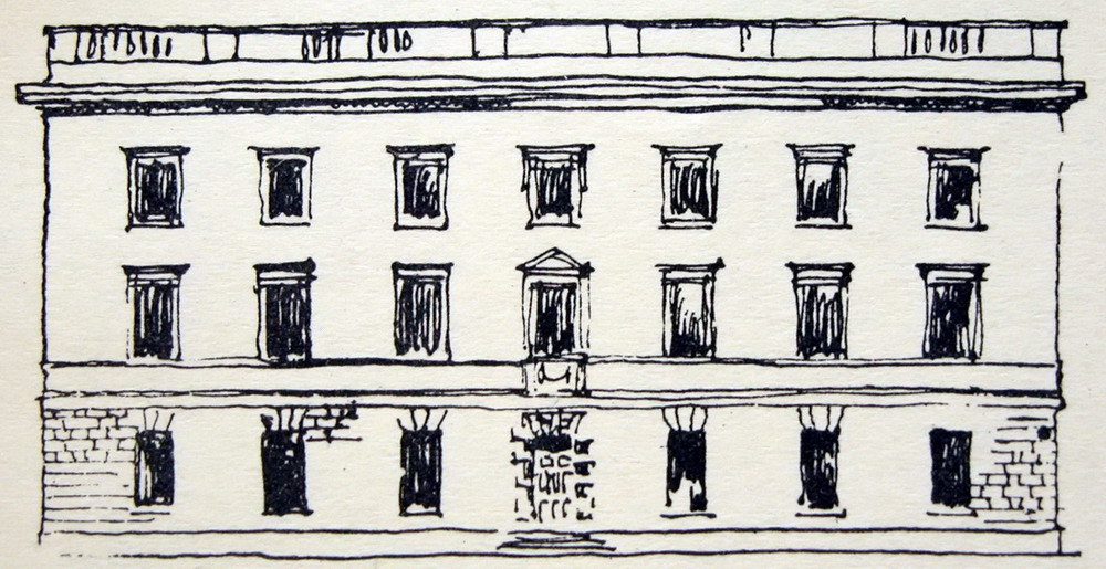 The classical orders are even easier to draw. We must distinguish the case of semi-columns and pilasters applied to the wall of a colonnade or independent: shadow lines accomplish this. The order articulate the façade and elements often articulate the order: it hints at the base, and above all we must make the capital, which if Corinthian or composite-richer effect, require additional serifs. 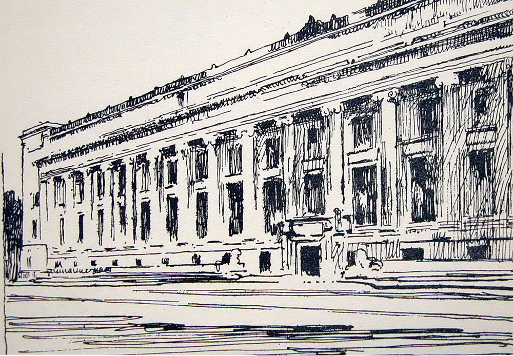  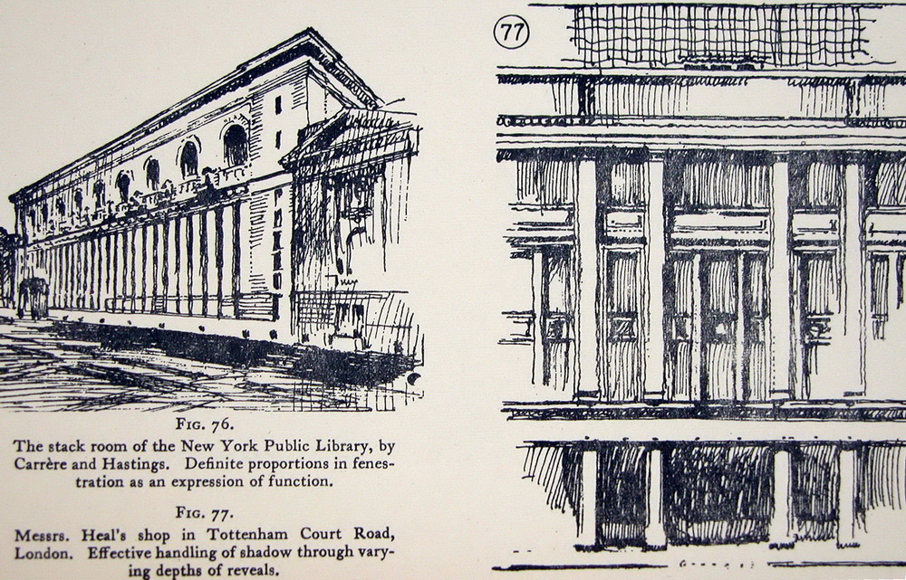 From there, involved the experience and personal taste. The following graphic depicts a scenic treatment, which accuses the cuts, ornaments and shadows in the corners only, and can afford state Transparency through large windows. The second drawing, a watercolor copy of Beaux-Arts displays qualities with more freedom, less formulaic, and is especially achieved the effect of transparency of the central area which is manifested through the large window frontage. In short, the scale involved. 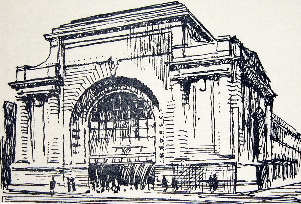 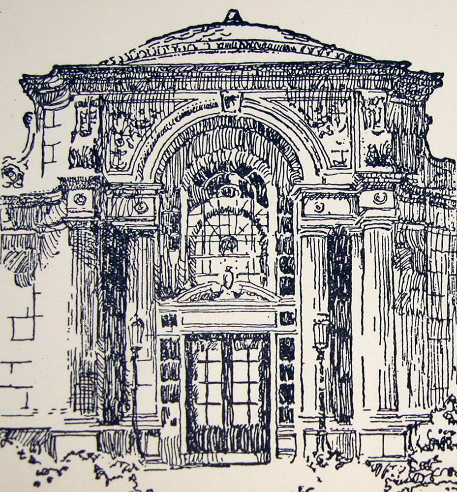 In the last two drawings Robertson summarized two portentous Beaux-Arts watercolors full of new effects and nuances had to summarize: simple stripes and black areas white or reservations. After this effort, when Robertson has reduced to its essential features (enough), we easily copy to Robertson, and learn from him how easy it is to draw a detail at any of the commands. I recommend trying: drawing once this facade of Parthenon, once a detailed drawing of the Doric order. Not all churches are like the Parthenon, Doric and not all organizations are identical, but they are so similar that, at some level, if you learn to draw one, you know how to draw (almost all) other, and above all learn to summarize many more. 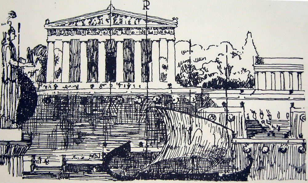 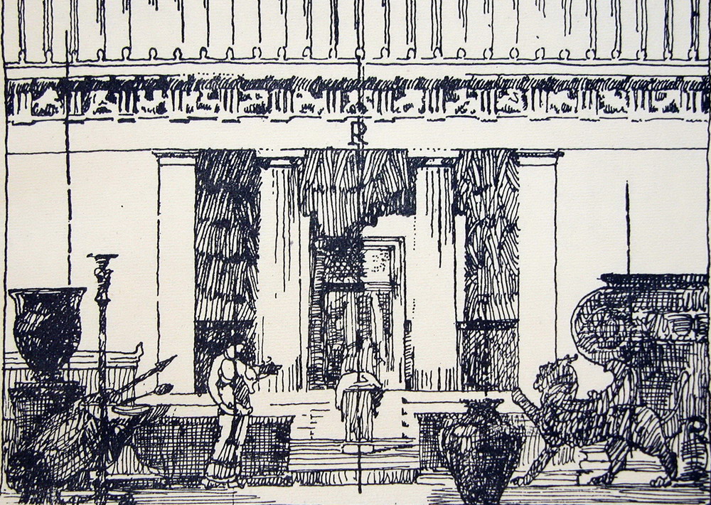 Howard Robertson: bibliographical noteThe Principles of Architectural Composition was very popular in UK and USA, and had repeated editions in 1924, 1931, 1942, 1945, 1947, 1948, 1950, 1955, 1963, in spite of previous architectural design is the modern movement. It is recommended, very easy to find and very cheap. Sir Howard Robertson (1888-1963) was a British architect of a shaft, which came to participate in the draft United Nations Headquarters, but was best known for his books on architectural theory. As is common in Saxon authors, books are not extensive or deep, or too learned, but collected a long experience, with great common sense, and are suggestive.
Contributed to the spread of the modern movement. His publications include:
• Architecture Explained, 1926. • Examples of French Modern Architecture, 1928, with the famous architectural photographer Frank R. Yerbury. It is a photographic portfolio, which also includes works of Le Corbusier. • Modern Architectural Design, 1932. • Arising Architecture, 1944. A recent collection of his articles, illustrated by photographs of Yerbury: • Travels in modern architecture, 1925-1930, London: Architectural Association, c1989. ---------------- Borrow (openlibrary.org) (~206 pg)Daisy
The principles of architectural composition
|
Joaquin Lorda. CLASSICAL ARCHITECTUREWatch and Draw3. Learning through drawing3. 1. The sketchbook3. 2. Drawing and enjoy3. 3. How to draw buildings3. 4. Students' drawings3. 5. Francisco Iñiguez's drawings |


| http://openlibrary.org/books/OL7240293M/Principles_of_architectural_composition Principles of architectural composition by Robinson, John Beverley • Add edition?
Principles of architectural composition
|

Không có nhận xét nào:
Đăng nhận xét
Lưu ý: Chỉ thành viên của blog này mới được đăng nhận xét.