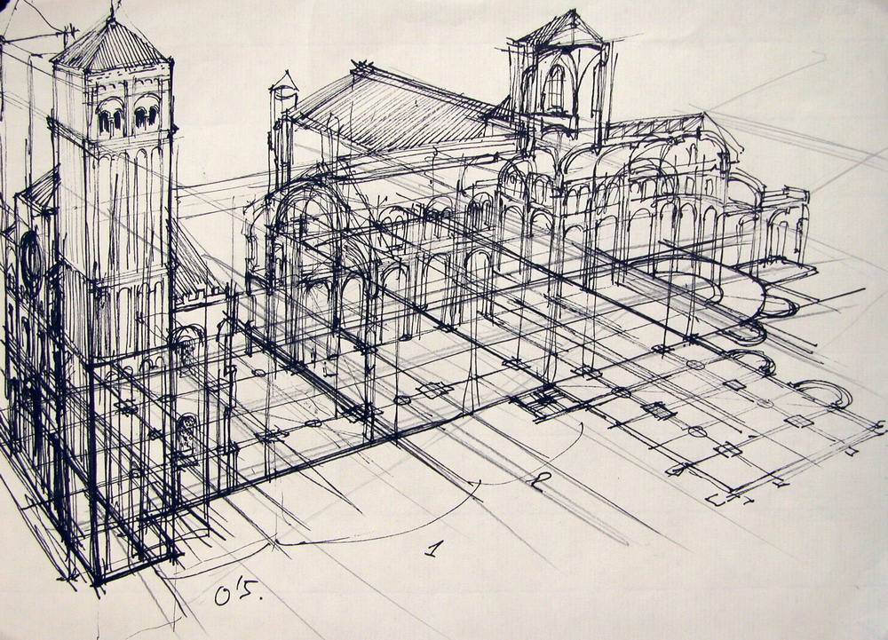
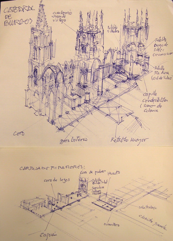
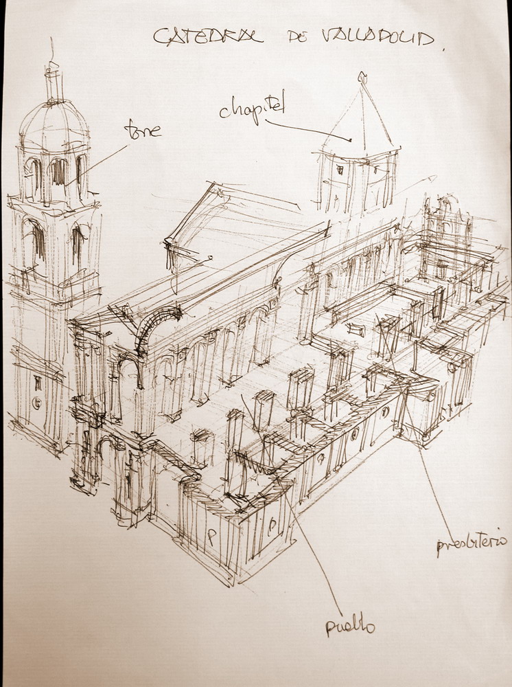
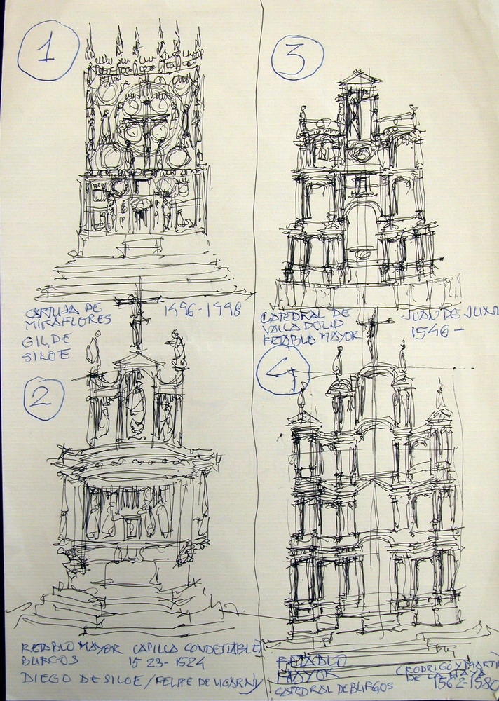
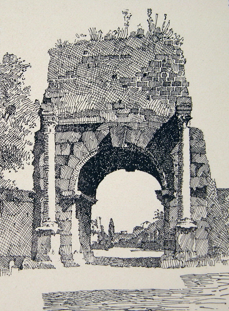
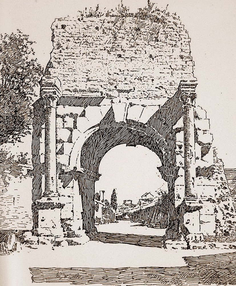
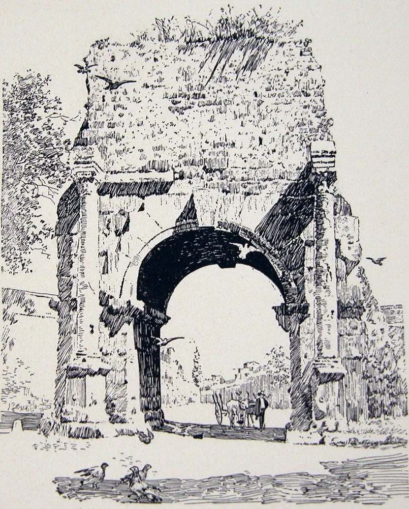
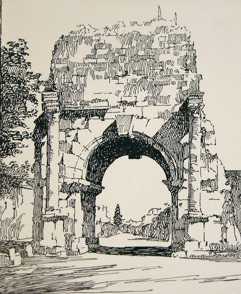
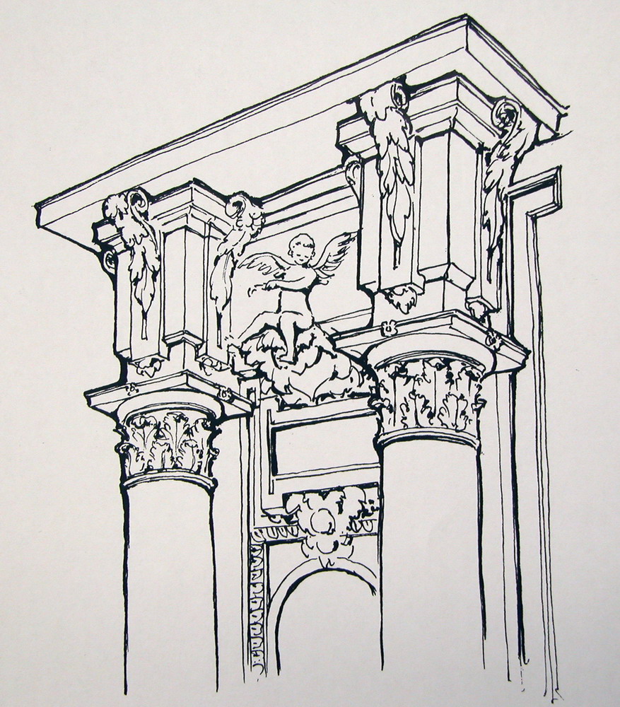
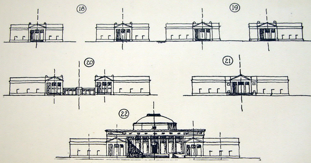
3. 3. How to draw buildingshttp://www.unav.es/ha/000-02-METO/dibujo-recetas.htmhttp://translate.google.com.vn/translate?hl=en&sl=es&u=http://www.unav.es/ha/001-TEOR/001-TEOR.html&prev=/search%3Fq%3Dhttp://www.unav.es/ha/001-TEOR/001-TEOR.html%2BENGLISH%26client%3Dfirefox-a%26hs%3DZ7g%26rls%3Dorg.mozilla:en-US:official&sa=X&ei=oTRuUajIDcn_iAfxl4HIBw&ved=0CDgQ7gEwAQPERSPECTIVE AND PLOTSWe are prepared (and trained) to detect any sign of relief, however poor. But also notice inconsistencies quickly, for that matter quite well built drawings.We grow the building from its origin. Sometimes it is helpful to draw a "frames" prospects, networks of lines leak at two points which are not commonly found in the paper (fig 1). This means learning to draw fans congruent-lines seem to concur in a point out of reach. The time it takes plants recover, then it is easy to enter any line. With a little practice, we incorporate the perspective intuitively: learn to draw volumes consistent no helplines (fig 2). With a little practice, tracing the outline or base enough to give the feeling of volume (fig 2). Draw anything, big or small, cuts, sections, plans, elevations, and is very easy, the drawings present (fig 3 and 4) are drawn from memory on a bus traquetante engine running, on an outing with students, which I forgot to bring the documentation. PHỐI CẢNH và các lô Chúng tôi được chuẩn bị (và được đào tạo) để phát hiện bất kỳ dấu hiệu hỗ trợ, tuy ít. Nhưng cũng nhanh chóng nhận thấy sự mâu thuẫn, để xây dựng bản vẽ tốt. Chúng tôi xây dựng phát triển các tòa nhà từ nguồn gốc của nó. Đôi khi thật là hữu ích để vẽ một "khung hình" triển vọng, mạng lưới những đường bị rò rỉ tại hai điểm mà không thường được tìm thấy trong các tờ giấy (hình 1).. Điều này có nghĩa là học tập để thu hút người hâm mộ đồng dạng đường dường như đồng tại điểm a ngoài tầm với. Thời gian thực vật phục hồi, sau đó nó rất dễ dàng thêm vào bất kỳ đường nào. Với một chút luyện tập, chúng tôi kết hợp các quan điểm bằng trực giác: học để thu hút khối lượng phù hợp không có đường dây (hình 2). Với một chút luyện tập, truy tìm các phác thảo hoặc cơ sở đủ để cung cấp cho các cảm giác của hình khối (hình 2). Vẽ bất cứ điều gì, lớn hay nhỏ, mặt bằng, mặt cắt, mặt đứng, cao độ, và rất dễ dàng, vẽ theo hiện tại (hình 3 và 4), vẽ theo ký ức trên một xe buýt đang chạy, trên một chuyến đi chơi với sinh viên, mà tôi quên mang tài liệu. PROPORTIONS There are no recipes for proportions. A drawing would provide a building slowly, starting from square. But in general, no time, we must plunge. It's like a jump, you have to try several times, but finally, the jump must be instantaneous, we can not settle for a drawing held and laborious, and also mediocre. The most common defects are exaggerated proportions: length, is decidedly longer, and the top is higher. There are people who unreasonably extend the columns, or increase the length of a palace. Many people, because they write in block letters or look too tilted sideways, bow their drawings. And very often draw larger or ignore the right side of a symmetrical figure. To correct these flaws, or at least warn, should look once the drawing upside down and the light. Our perception that perceives defects immediately detect a sense of direction. Tỷ lệ. Không có công thức cho tỷ lệ. Một bản vẽ sẽ cung cấp một xây dựng từ từ, bắt đầu từ hình vuông. Nhưng nói chung, không có thời gian, chúng ta phải lao vào. Giống như một bước nhảy, ta phải thử nhiều lần, nhưng cuối cùng, phải nhảy được tức thời, chúng ta không thể giải quyết cho một bản vẽ tổ chức và mất thời gian, và cũng tầm thường. Các khiếm khuyết phổ biến nhất là tỷ lệ phóng đại: chiều dài, còn quyết, và đỉnh cao. Có những người bất hợp lý mở rộng các cột, hoặc tăng chiều dài của một cung điện. Nhiều người, vì họ viết bằng chữ in hoa hoặc nhìn quá nghiêng nghiêng, cúi bản vẽ của họ. Và rất thường xuyên vẽ lớn hơn hoặc bỏ qua phía bên phải của một con số đối xứng. Để khắc phục những sai sót, hoặc ít nhất là cảnh báo, nên xem xét một lần vẽ lộn ngược và ánh sáng. Nhận thức của chúng tôi mà nhận thức khiếm khuyết ngay lập tức phát hiện một cảm giác định hướng. QUICK DRAW WITH TRACER It's good to draw with anything that stains, a pen or a marker that we have on hand. Years ago I was convinced that the best instrument would be a pen, now I think it is best to draw with the pen cheaply as possible, allowing fine lines to draw support and strengthen some other pressing. lines If we know what we want to draw, just the intention, is to draw lines that follow the direction that seems to suggest the elements. The drawings in Fig 4 memory I had to make the engine a bus that took us to Burgos on a school trip after discovering that he had forgotten the documentation: are drawn to photocopy and distribute them among the attendees, and are solved with simple lines and a streaked elementary minimal reminder; mediocre, but adequate. shades Fast shadows. The great contrasts. Effective in small pictures, or done very quickly. striped The artists of eighteenth century architecture took advantage of all of the scratches. In the detail of a Roman view painter Canaletto faster stripes are observed always in the same direction. The striped suggest both dark shadows and bright skies, colors and textures. The design retains the vibration of the transparency of shadows and reflections, which are never dull, and is a good lesson. Drawing with pen Since the early nineteenth century, widespread academic study and travel, spread architectural drawing itself to take note of the buildings they know in their travels. The new designers used a special instrument, which replaces the old reed pens or poultry: the pens of metal, steel, which spread from the first decades of the century. The nib, already common in the mid-nineteenth century was much more flexible, and the ink lasted a little longer, allowing a firmer line and length, but also a gradient of greater widths. But the steel nib, with his ink annexed, would be uncomfortable with the pencil. To nineteenth century, invented the fountain pen, the pen wrote many hours, allowing a faster stroke, a long line, and could be evaluated, as it increases its thickness when pressed on the pen, so that elements were introduced intense black, with an effective contrast. This type of pen drawing, reproduced very well in photographs (magazines), and was linked with historic architecture, for the pen is released while the eclectic fashions. And many architects sketched his sketches for this instrumental. Since the late nineteenth century to the twenties of our own, English and American schools of architecture train their students in this way that leverages the potential well of the pen. drawing with pen Since the early nineteenth century, widespread academic study and travel, spread architectural drawing itself to take note of the buildings they know in their travels. The new designers used a special instrument, which replaces the old reed pens or poultry: the pens of metal, steel, which spread from the first decades of the century. The nib, already common in the mid-nineteenth century was much more flexible, and the ink lasted a little longer, allowing a firmer line and length, but also a gradient of greater widths. But the steel nib, with his ink annexed, would be uncomfortable with the pencil. To nineteenth century, invented the fountain pen, the pen wrote many hours, allowing a faster stroke, a long line, and could be evaluated, as it increases its thickness when pressed on the pen, so that elements were introduced intense black, with an effective contrast. This type of pen drawing, reproduced very well in photographs (magazines), and was linked with historic architecture, for the pen is released while the eclectic fashions. And many architects sketched his sketches for this instrumental. Since the late nineteenth century to the twenties of our own, English and American schools of architecture train their students in such a way that exploits very well the possibilities of the pen. Textures Reproduce drawings of a competition launched in 1898 by Brochure Series (see: No 11, November, 1898), his jury was made by Bertram G. Goodhue (discussed) and Charles D. Maginnis, the two artists were exceptional pen (on Maginnis, see: Pen Drawing, 1898; on Goodhue, Architectural and Decorative Drawings see, 1914). It was a picture play pen Drusus arc, thus a section of the aqueduct called Antoniniana, which served the Baths of Caracalla in Rome. Competed more than 120 architects and students, and the leading listed here (Figure 5-10). They are quite elaborate drawings, little loose, but as representing exactly the same shape, learn how to express them materials of all kinds. black drop This kind of design is suitable to illustrate, it's about the shadow minimum stain, which allows improving volumes, and to suggest some textures that would be embarrassing petite more details. The cartoonists around 1800, as the illustrator John Flaxman (1755-1826), learned to draw with perfect lines and only slightly valued, the refined drawing figures that adorned the Greek ceramics, but it is necessary to train a lot, and have a special pulse - to achieve a line like: fine, safe and continuous. If we disregard this extraordinary perfection, it is very easy to draw anything, just drop lines and shadow (fig 11, 12). Learning with Howard Robertson In an intermediate genus are the following drawings, which illustrate buildings and elements on any scale. The long pulled out a beautiful book: Howard Robertson, The Principles of Architectural Composition, London: Architectural Press, 1924. Although this book is learned architectural composition, we took advantage of it to learn to illustrate: a rapidly represent historic architecture. There are nearly 170 drawings printed in the book (which reduces a little), and measure 7 or 8 cm. The author intended to illustrate his ideas about architectural composition, comparing various details and elements of many different buildings, you could not edit the book with many photographs, was forced to run fast cartoons, unpretentious quality. And the illustrations are illustrative, much more than if they were photographs. Trong một loại trung bình là các bản vẽ, minh họa các tòa nhà và các thành phần theo nhiều tỷ lệ. Một cuốn sách đẹp kéo dài: Howard Robertson, Những nguyên tắc bố cục kiến trúc, London: kiến trúc Press, 1924. Mặc dù cuốn sách này là học về bố cục kiến trúc, chúng tôi đã lợi dụng nó để tìm hiểu minh họa: diễn họa nhanh cho lịch sử kiến trúc. Có gần 170 bản vẽ in trong cuốn sách (mà làm giảm một chút), và các biện pháp 7 hoặc 8 cm. Các tác giả dự định để minh họa cho ý tưởng của mình về thành phần kiến trúc, so sánh các chi tiết khác nhau và các yếu tố của các tòa nhà khác nhau, bạn không thể chỉnh sửa cuốn sách với nhiều hình ảnh, đã buộc phải chạy các phim hoạt hình nhanh chóng, chất lượng khiêm tốn. Và các hình minh họa là minh họa, nhiều hơn nếu họ là các bức ảnh. Obviously, the first is the general definition of the building. If we make a minimal schema, simply collect the minimum elements of silhouette, and articulation of walls. We begin by pointing out the domes, arcades (defined only by a small shadow) and a few holes, perhaps no need for everyone. The pattern suggests that there are more things that are not defined, that there are embellishments, the holes are deep, not a dull spot.           Know how to draw plants may seem complicated to a first-unattainable goal, but the plants in the historic buildings are often highly ordered, and abound in symmetry: no need to draw everything, sufficient to indicate the main spaces: While it is important to purchase a feeling tectonic the walls, not thinned or thickened so unlikely: so that the building looks like a paper cut, or a lump of clay is very easy (and rewarding) to draw lines, suggest areas and solid scratch. 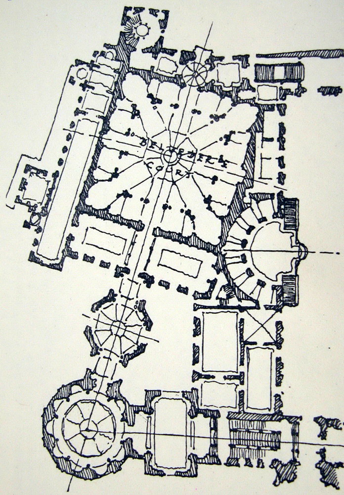 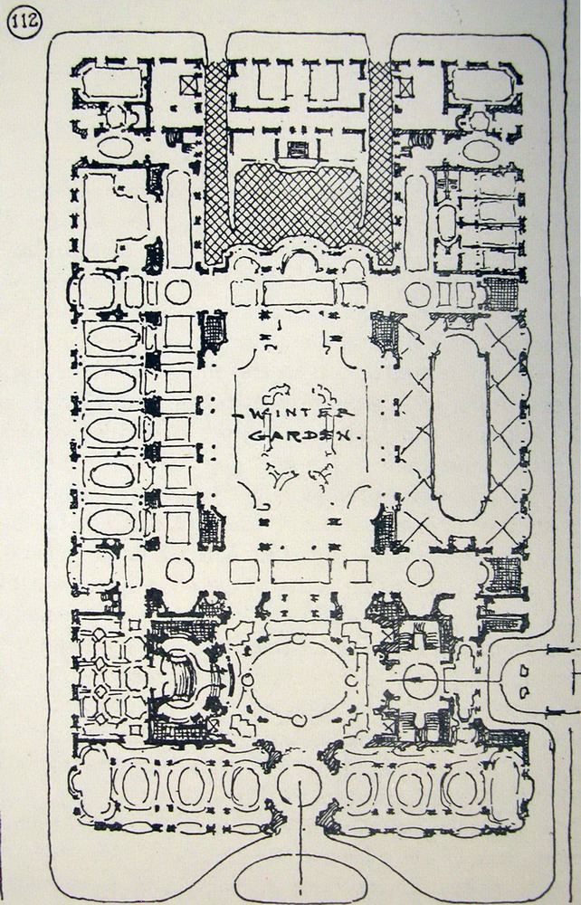 The textures are often very complicated very repetitive, and easily reduced to points and shadow areas, even in examples as puzzling as the elaborate facade of Wells Cathedral or the arches of a cloister: it is not difficult, but you should know how they are, to outline, in these drawings the arches are drawn, very fast, but cautions that are arcs, which are targeted, and which are visible, more or less, enough to give the impression of an ornate display of ornament trabajadísima or a complex molduración accompanying intricate arches. 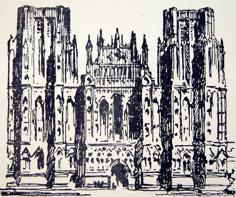 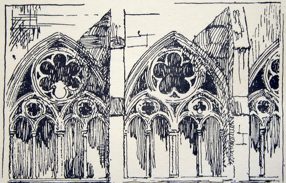 Ordinarily, the volumes are very simple, and whether to reflect only the elementary masses, just a quick scratch. The ordinary is presenting a finished and some texture: flashlights, ledges, gaps, and perhaps some ornament. 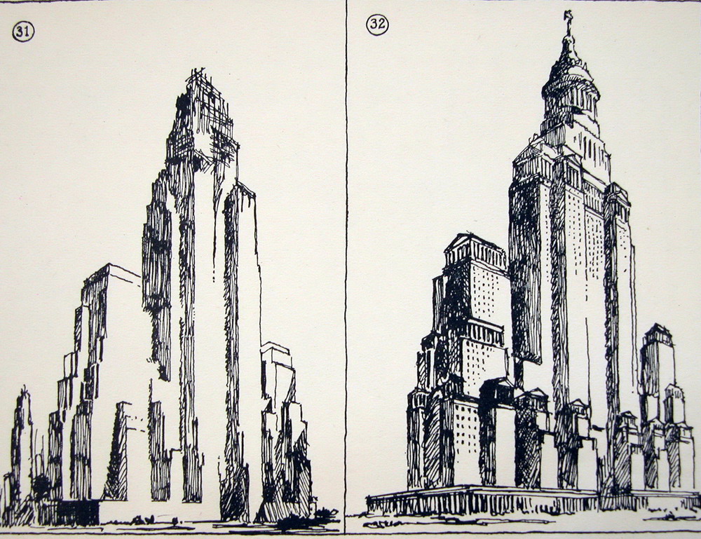 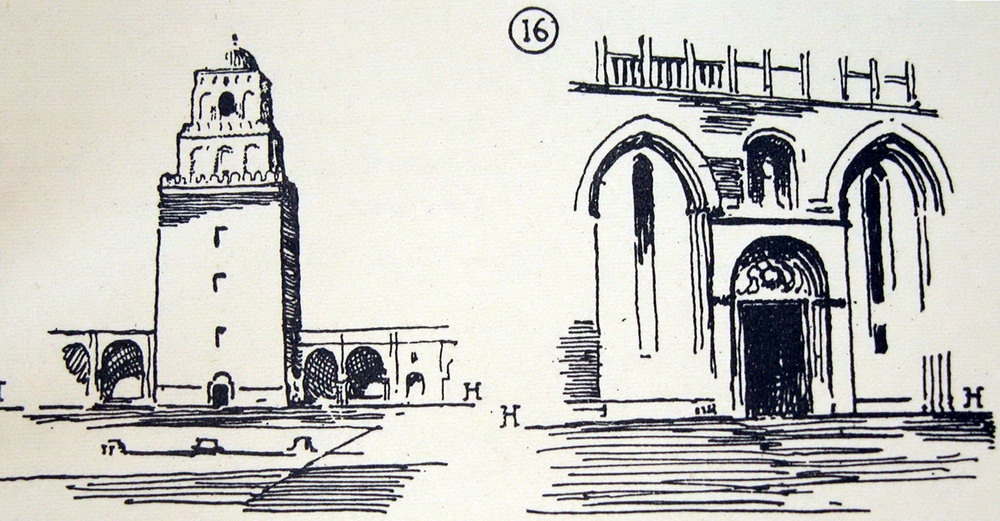 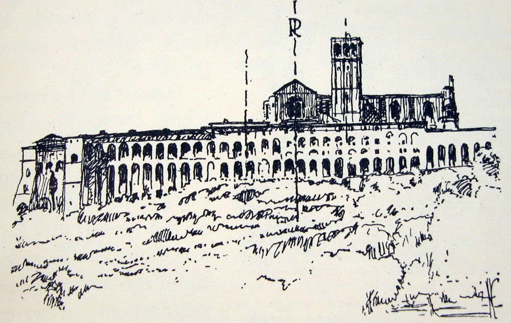 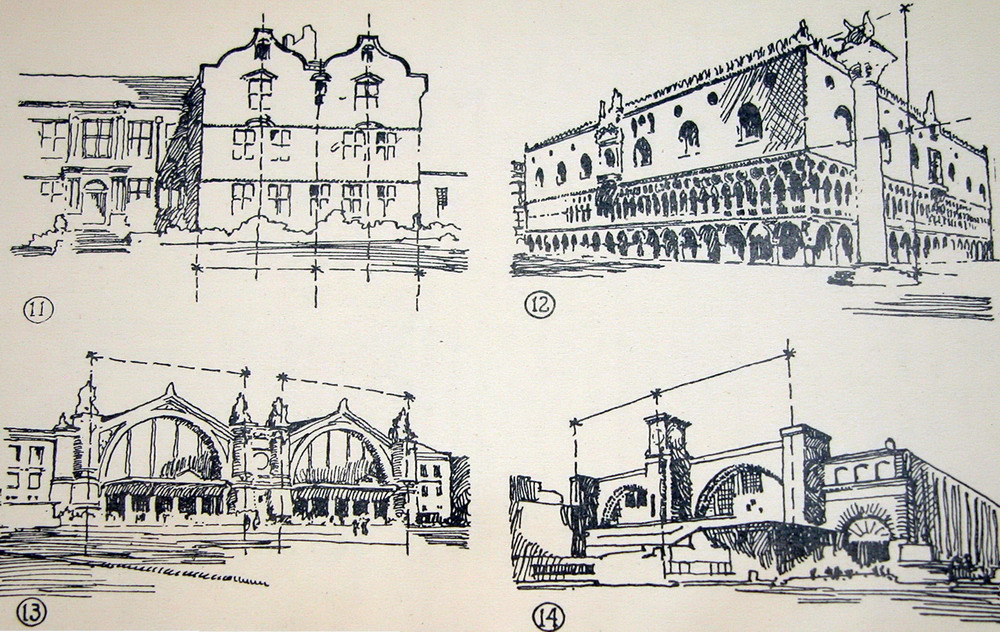 And the great buildings show a number of arches, niches, windows, ordinarily are pierced by large openings. It's easy to give the impression of an infinity of open windows neatly in a large area. According to the scale and degree of ornament is required to stop for a bit more, but never much. The more drawn is a unique element in the set will be noticed more, seek too much attention, and spoil the view of the whole. 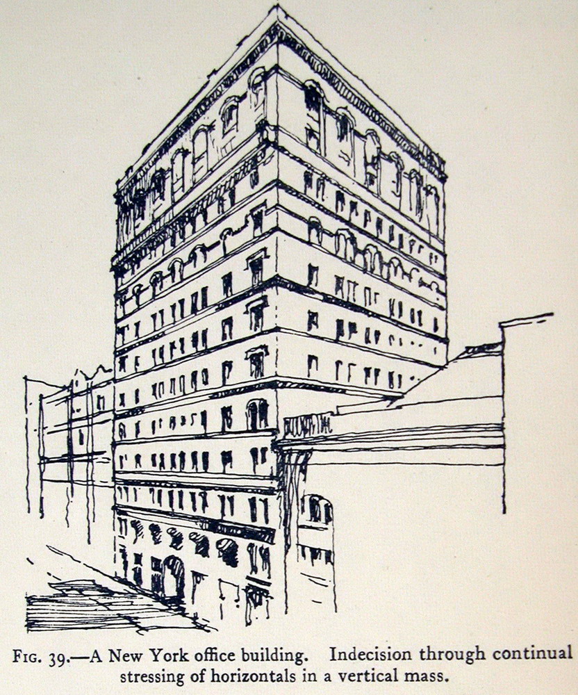   And The walls sometimes have very distinct textures: in general is very easy to tell, and is a nice discovery is not necessary to complete drawings and insistently, can be replaced by some brief shadows, and even do so only in some areas, leaving the others for understatement: a hint is enough. 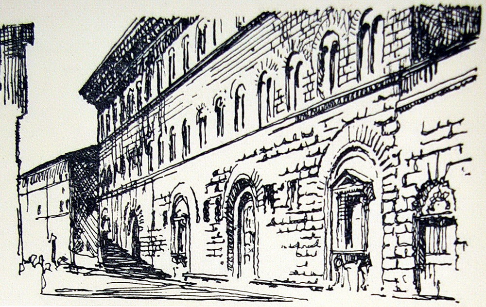 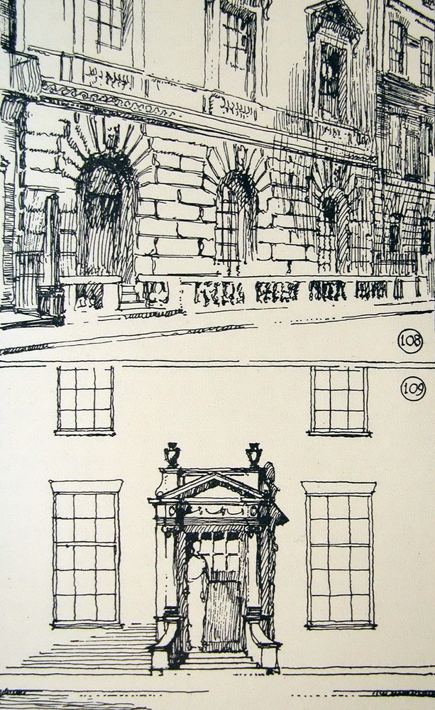 The classical building facades are particularly easy to summarize. The two examples below are significant. No need to draw all the gaps, and fewer still give them exactly the same treatment. But you can not do without informing Minimum horizontal moldings and friezes articulate the facade and trim the fences that mark the main spans (dust and pediments), and a special feature as heraldic crests covers with.  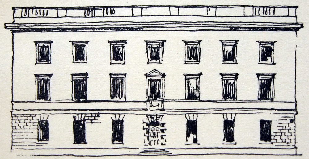 The classical orders are even easier to draw. We must distinguish the case of semi-columns and pilasters applied to the wall of a colonnade or independent: shadow lines accomplish this. The order articulate the façade and elements often articulate the order: it hints at the base, and above all we must make the capital, which if Corinthian or composite-richer effect, require additional serifs. 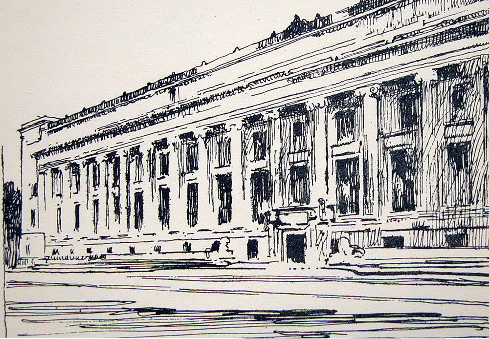  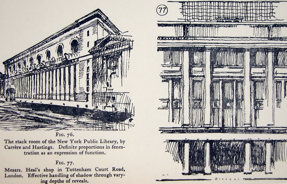 From there, involved the experience and personal taste. The following graphic depicts a scenic treatment, which accuses the cuts, ornaments and shadows in the corners only, and can afford state Transparency through large windows. The second drawing, a watercolor copy of Beaux-Arts displays qualities with more freedom, less formulaic, and is especially achieved the effect of transparency of the central area which is manifested through the large window frontage. In short, the scale involved. 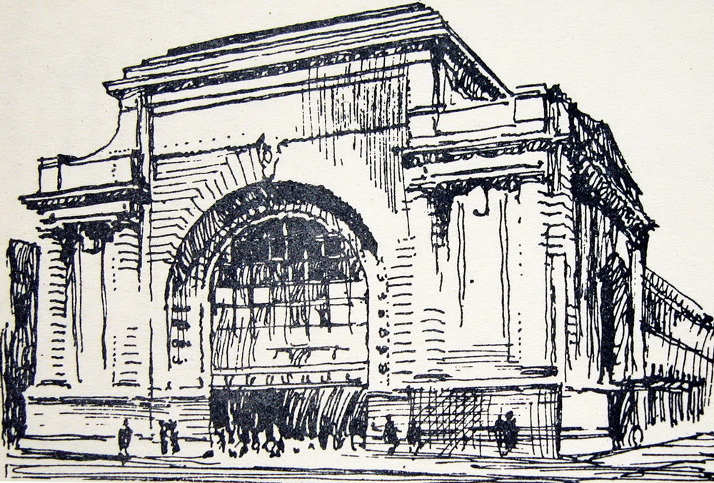 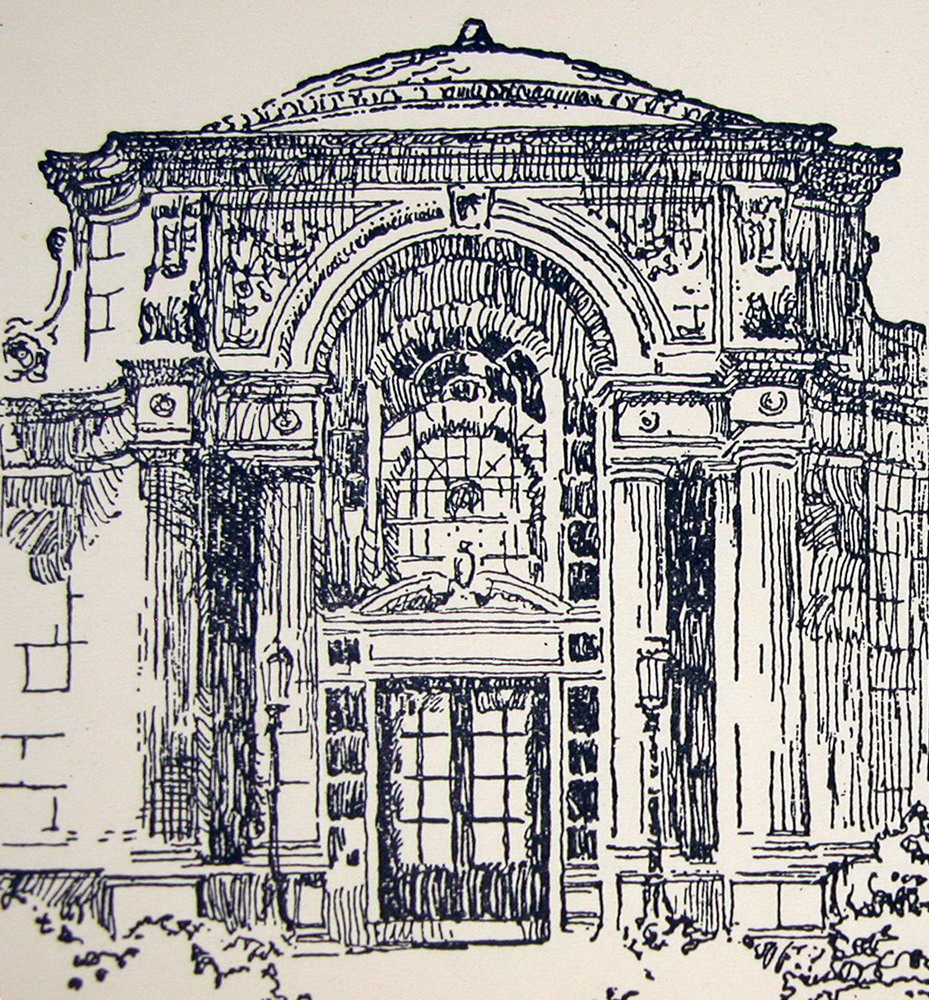 In the last two drawings Robertson summarized two portentous Beaux-Arts watercolors full of new effects and nuances had to summarize: simple stripes and black areas white or reservations. After this effort, when Robertson has reduced to its essential features (enough), we easily copy to Robertson, and learn from him how easy it is to draw a detail at any of the commands. I recommend trying: drawing once this facade of Parthenon, once a detailed drawing of the Doric order. Not all churches are like the Parthenon, Doric and not all organizations are identical, but they are so similar that, at some level, if you learn to draw one, you know how to draw (almost all) other, and above all learn to summarize many more. 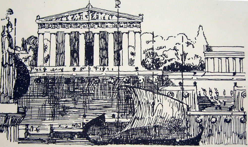 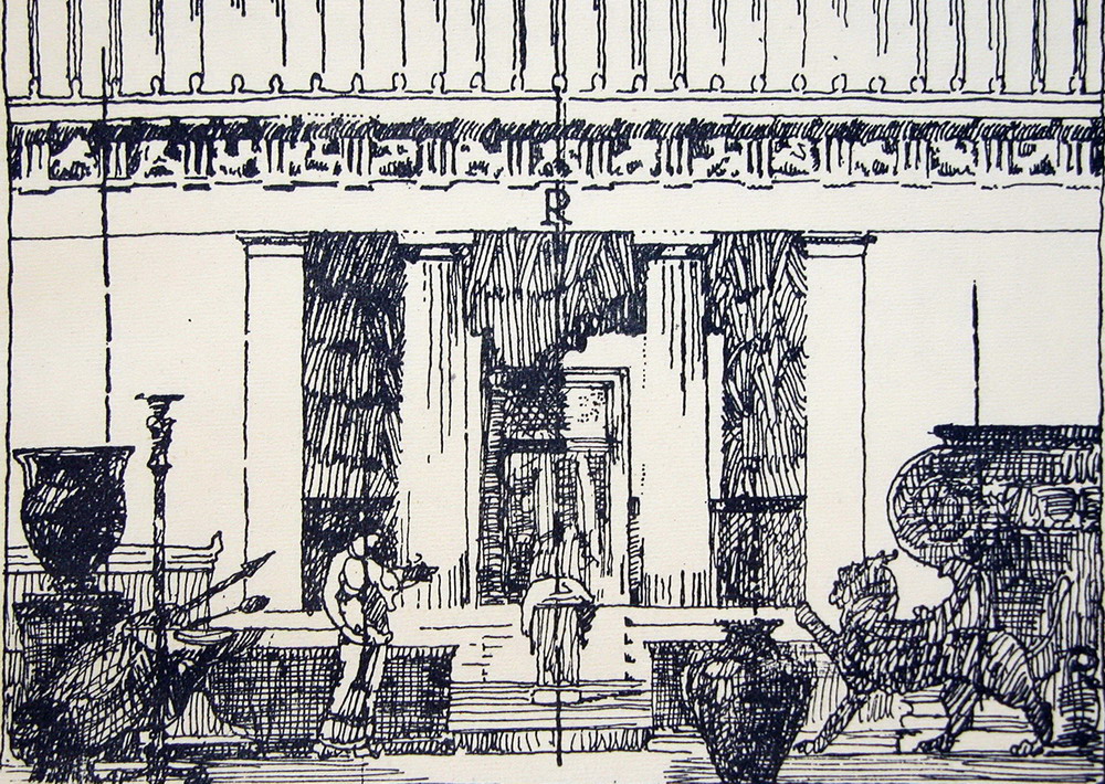 Howard Robertson: bibliographical noteThe Principles of Architectural Composition was very popular in UK and USA, and had repeated editions in 1924, 1931, 1942, 1945, 1947, 1948, 1950, 1955, 1963, in spite of previous architectural design is the modern movement. It is recommended, very easy to find and very cheap. Sir Howard Robertson (1888-1963) was a British architect of a shaft, which came to participate in the draft United Nations Headquarters, but was best known for his books on architectural theory. As is common in Saxon authors, books are not extensive or deep, or too learned, but collected a long experience, with great common sense, and are suggestive.
Contributed to the spread of the modern movement. His publications include:
• Architecture Explained, 1926. • Examples of French Modern Architecture, 1928, with the famous architectural photographer Frank R. Yerbury. It is a photographic portfolio, which also includes works of Le Corbusier. • Modern Architectural Design, 1932. • Arising Architecture, 1944. A recent collection of his articles, illustrated by photographs of Yerbury: • Travels in modern architecture, 1925-1930, London: Architectural Association, c1989. ---------------- Borrow (openlibrary.org) (~206 pg)Daisy
The principles of architectural composition
|
Joaquin Lorda. CLASSICAL ARCHITECTUREWatch and Draw3. Learning through drawing3. 1. The sketchbook3. 2. Drawing and enjoy3. 3. How to draw buildings3. 4. Students' drawings3. 5. Francisco Iñiguez's drawings |


Principles of architectural composition by Robinson, John Beverley • Add edition?

Không có nhận xét nào:
Đăng nhận xét
Lưu ý: Chỉ thành viên của blog này mới được đăng nhận xét.